
Information architecture, navigation, taxonomy
Strategy
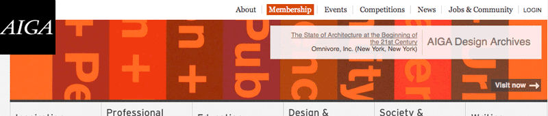
AIGA, the professional association for design, had recently launched a newly re-designed website when I became Web Director in 2007. However, usability issues emerged. Staff and member reports revealed:
- People weren’t finding what they wanted.
- There were too many steps to perform simple tasks.
- Site visitors couldn’t figure out what the organization was and what it did.
- Return visitors didn’t recognize new content, leaving some with the sense that the site wasn’t current.
- Members couldn’t figure out how to create or maintain their portfolios. Employers couldn’t figure out how to find designers. Designers couldn’t figure out how to search for jobs.
- Everyone regularly confused login and search fields.
- Staff lacked means to promote organization events, deadlines and news.
Goals:
Key issues were to:
- Discover what visitors wanted, but couldn’t find, and which tasks they had trouble performing.
- Revise taxonomy, particularly navigation labels, to be consistent with user expectations and business goals.
- Improve form design and simplify processes.
- Remove extraneous or duplicative pages and reduce steps in task flow.
- Clarify that AIGA is a member-based organization with chapters around the country and world.
- Promote organization news and events, without increasing staff workload.
Process:
I led the AIGA web team to work with tools at hand or freely available via web services. In addition to instituting site evaluation with Google Analytics, analysis included:
- Perform informal user-testing with staff, guests visiting the office, members attending events – and other random bystanders we could get in front of a web browser.
- Evaluate existing site map and taxonomy to identify redundancies, inconsistencies and orphaned content.
- Identify low-hanging fruit, i.e., things easily remediated by moving content within existing architecture.
- Determine where browser redirects required for eliminated pages and rewrites would suffice.
As changes were implemented, online behavior and member requests served as live usability tests, leading to further iterative changes.
Results:
Gradual but significant changes to AIGA’s navigation, drastically reduced support requests and complaints, over three years. As a whole, these modifications drew broad praise for increased ease of use, without causing alarm to regular site visitors.
The improvements included:
- Iterative, subtle changes to navigation labels and elimination of redundancies that addressed a host of usability problems.
- The separation of login and search tasks resulted in near-elimination of a large set of support requests.
- Increased real estate devoted to chapters and member benefits helped to broadcast that AIGA is a member-based organization.
- Moving the login to the topmost nav bar and making it link to a member management page – with upsell opportunities for non-members.
- Clearly differentiating and sampling content from the two formerly most not-found links – AIGA’s member portfolios site and Design Job listings site – drove much traffic to them, while eliminating support requests.
- Consistent presentation of information across the site eased user experience across the board.
- Simple additions to the CMS toolset permitted re-use of data to populate news throughout the site and to RSS feeds.
- Addition of social media feeds helped keep the site looking up-to-date.


This revised layout eliminated that risk.